
Eye-catching portfolio design elements are the visual and structural choices that communicate your value within seconds of a visitor landing on your page. Recruiters spend about 6 seconds scanning a portfolio before deciding whether to keep reading. That means your layout, color choices, and content hierarchy do the selling before a single word gets read. The Nielsen Norman Group and WCAG accessibility standards both confirm that clarity and usability outperform visual complexity every time. Get these elements right, and your portfolio stops being a gallery. It becomes a client magnet.
1. What are the foundational eye-catching portfolio design elements?
A strong portfolio layout starts with a grid system. A 12-column grid supports editorial complexity while keeping alignment consistent and user flow predictable. Consistent alignment creates rhythm. Rhythm signals professionalism before the visitor reads a single word.
White space is not wasted space. Generous spacing between elements reduces visual overload and lets your work breathe. Portfolios that cram every pixel with content signal desperation, not confidence.
Mobile-first design is non-negotiable. Your portfolio must be fully responsive down to 375px screen width, with a minimum 16px body text size for readability. Mobile traffic accounts for a significant share of portfolio views, and a layout that breaks on a phone loses real opportunities.
- Use a 12-column grid for consistent alignment across all pages
- Set body text at 16px minimum and line height at 1.5 for comfortable scanning
- Keep line lengths between 60–80 characters per line to reduce reading fatigue
- Test every layout on a 375px screen before publishing
Pro Tip: Maintaining a unified grid system across your entire portfolio makes future updates faster and keeps your visual identity consistent as your work grows.
2. Color and texture techniques that make portfolios memorable
Color is one of the fastest ways to build brand recognition. Limiting your palette to 3–4 colors maintains visual cohesion and prevents the kind of noise that makes visitors click away. Every color beyond that threshold competes for attention instead of directing it.

Accent colors do the heavy lifting. Pick one accent color and apply it consistently to buttons, hover states, and key headings. That repetition trains the visitor’s eye and creates a brand association that sticks after they leave your page.
Texture overlays add depth without adding clutter. Subtle paper, canvas, or cotton textures applied at low opacity give digital portfolios a tactile, premium feel. This technique works especially well for photographers, illustrators, and product designers whose clients expect a refined aesthetic.
Two strong trends define 2026 portfolio color design. Retro futurism pairs warm analog tones with electric accent colors for a bold, confident look. Dark mode themes with high-contrast typography signal technical sophistication and are particularly popular among developers and UX designers.
Pro Tip: Apply your portfolio color palette consistently across your social profiles, email signature, and any client-facing documents. Brand recognition compounds across every touchpoint.
3. How content positioning and hierarchy improve portfolio effectiveness
Recruiters scan portfolios in 6 seconds, so your positioning statement must appear above the fold. That means your role, domain, and primary skill set should be the first thing a visitor reads. “Brand identity designer for consumer startups” communicates more in five words than a full paragraph of vague mission copy.
Your homepage should feature 4–6 of your strongest projects. That number is deliberate. Too few and you look inexperienced. Too many and the visitor stops choosing and leaves. Curating ruthlessly is itself a signal of good judgment.
Avoid hero carousels and rotating banners. They delay the moment a visitor understands what you do. Static, confident positioning beats animated ambiguity every time.
- Place your elevator pitch (role + domain + stack) in the first visible section
- Limit homepage projects to your 4–6 best pieces only
- Use clear size distinctions between headings, subheadings, and body text
- Add a two-sentence caption to each project explaining the problem you solved
Pro Tip: Write your homepage headline as if you have one sentence to convince a skeptical recruiter. If it takes more than one read to understand what you do, rewrite it.
Good portfolio site conversion depends on this hierarchy working from the very first scroll. Visitors who understand your value immediately are far more likely to contact you.
4. Interactive and motion design features that enhance engagement
Subtle motion design separates memorable portfolios from static ones. Smooth hover states, color shifts, and gentle opacity transitions add interactivity without slowing the page or confusing the visitor. These micro-interactions signal craft. They tell the visitor you pay attention to detail.
Scroll-triggered animations work well when they reinforce content rather than distract from it. A project card that fades in as you scroll down feels intentional. A full-screen animation that plays before you can read anything feels like an obstacle.
Custom cursor effects and dynamic navigation masks are tasteful details that reward attentive visitors. They work best when they are subtle enough that most people do not consciously notice them, but would notice their absence. That is the standard for good motion design on websites.
Overly complex animations increase load times and frustrate recruiters on slower connections. Fast loading is a design choice, not a technical afterthought.
Pro Tip: Test your portfolio on a throttled 3G connection before launch. If it feels slow to you, it will feel slow to a recruiter checking portfolios on a train.
5. Layout structures that work for standout portfolio pages
Gallery Grid layouts are the most reliable starting point for designers whose content is still maturing. They organize work into a clean, scannable format that lets the projects speak for themselves. The grid communicates order and control without requiring complex custom code.
Distinctive portfolios blend standard UI blocks with authored elements. Interactive 3D and scroll-driven motion can signal technical depth when used with restraint. The key is that every authored element must serve the work, not overshadow it.
Full-width layouts work well for photographers and videographers. Narrow, centered layouts work better for writers and strategists. Match your layout structure to the type of work you are showcasing, not to the trend you admire most.
Asymmetric layouts create visual tension that draws the eye. They work when the underlying grid is still present and the asymmetry feels deliberate. Random asymmetry reads as a mistake. Intentional asymmetry reads as confidence.
6. Portfolio pages beyond the homepage that win clients
The About page is frequently the most visited page after the homepage. Most designers treat it as a resume. The ones who get hired treat it as a story. Write about your design philosophy, your process, and what kinds of problems excite you. That specificity builds trust faster than a list of software skills.
Case studies are where portfolios win or lose serious clients. A strong case study follows a clear structure: the problem, your process, and the measurable outcome. Balanced visuals and text keep the reader moving. A wall of screenshots with no explanation tells the visitor nothing about how you think.
Contact pages with visible emails, LinkedIn links, and scheduling options remove friction from outreach. Every extra step between “I want to hire this person” and “I’ve sent a message” costs you a potential client.
SEO and accessibility matter more than most designers realize. Unique title tags, meta descriptions, alt text, and fast page speed improve discoverability. WCAG-compliant color contrast and keyboard navigation signal professionalism to clients who notice these details.
| Page | What makes it effective |
|---|---|
| About | Personality, process, and philosophy over a dry resume |
| Case studies | Problem, process, and outcome with supporting visuals |
| Contact | Visible email, LinkedIn, and a scheduling link |
| Homepage | 4–6 curated projects with clear positioning above the fold |
Pro Tip: Keep your navigation to five items or fewer. Every extra link dilutes the path to your contact page, which is the only conversion that matters.
Common homepage design mistakes like cluttered navigation and buried contact information directly reduce the number of inquiries you receive. Fix those first before worrying about motion effects.
Key takeaways
The most effective portfolio design combines clear positioning, a limited color palette, mobile-first layout, and subtle interactivity to convert visitors into clients before they finish their first scroll.
| Point | Details |
|---|---|
| Front-load your positioning | Place your role and domain above the fold so recruiters understand you in 6 seconds. |
| Limit your color palette | Use 3–4 colors maximum to build brand recognition without visual noise. |
| Design mobile-first | Build for 375px screens with 16px minimum body text before scaling up. |
| Use motion with restraint | Smooth hover states and scroll animations signal craft without slowing the page. |
| Make every page count | About, case study, and contact pages close clients that the homepage attracts. |
What I’ve learned from portfolios that actually get people hired
I’ve reviewed a lot of portfolios over the years, and the ones that win clients share one quality that has nothing to do with visual flair. They are easy to understand fast. The designer’s role is clear. The work is curated. The contact page is one click away.
The portfolios that lose clients are usually the ones that tried too hard. Full-screen video intros, loading screens, and parallax effects on every section. They look impressive in a design awards gallery. They frustrate a hiring manager who has 40 portfolios to review before lunch.
The uncomfortable truth is that portfolios built to get you hired prioritize usability and storytelling over visual complexity. The about page matters more than most designers think. A well-written case study that explains your thinking will outperform a beautiful but silent gallery every time.
Mobile-first thinking is not optional anymore. If your portfolio breaks or slows on a phone, you are losing clients before they see your best work. Speed is a design decision.
The designers I have seen land the best clients are the ones who treat their portfolio like a product. They test it, they update it, and they make sure every page has a clear purpose. That discipline shows up in the work they do for clients too.
— Youri
How Ydjmedia helps you build a portfolio that converts
A well-designed portfolio is only as effective as the platform it runs on. Ydjmedia builds modern, mobile-first websites that apply every principle covered here: clean grid layouts, fast load times, accessible color contrast, and clear calls to action. You can see your site live before committing a dollar, thanks to Ydjmedia’s no-risk free demo.
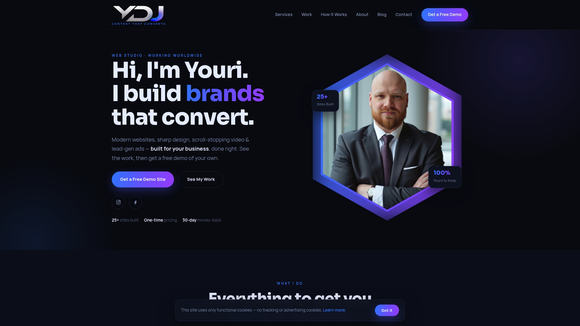
Ydjmedia handles the technical side so you can focus on your work. No retainers, no agency runaround, and a 30-day money-back guarantee. If you want a portfolio that positions you clearly, loads fast, and turns visitors into paying clients, Ydjmedia is the place to start.
FAQ
How many projects should a portfolio homepage show?
Limit your homepage to 4–6 of your strongest projects. Recruiters scan quickly, and a curated selection signals better judgment than an exhaustive archive.
What is the best color palette size for a portfolio?
Use 3–4 colors maximum. A limited palette builds visual cohesion and brand recognition without creating the noise that drives visitors away.
Why does mobile-first design matter for portfolios?
Mobile traffic accounts for a significant share of portfolio views. A portfolio that breaks on a 375px screen loses real opportunities before the visitor sees your work.
What should a portfolio About page include?
Focus on your design philosophy, process, and the types of problems you enjoy solving. Hiring managers and clients use the About page to assess cultural fit, not just credentials.
How do motion effects impact portfolio performance?
Smooth hover states and scroll-triggered animations signal craft and attention to detail. Overly complex animations increase load times and frustrate recruiters, so keep motion subtle and purposeful.