
Conversion-optimized design is the purposeful creation of website elements to increase the rate at which visitors complete a desired action, such as a purchase, signup, or inquiry. The industry term for this practice is conversion-centered design (CCD), a framework that treats every visual and structural decision as a direct lever on business outcomes. What does conversion-optimized design mean in practice? It means building pages around a single measurable goal, using deliberate visual hierarchy, and removing anything that pulls attention away from that goal. Ydjmedia applies these principles to every site it builds, because a beautiful page that does not convert is just an expensive brochure.
What are the core principles of conversion-optimized design?
Conversion-centered design rests on one foundational rule: one page, one goal. Marketing frameworks popularized by Oli Gardner call this the 1:1 attention ratio. Every link, image, and block of text on a page competes for the visitor’s cognitive energy. When you add competing navigation, sidebar widgets, or secondary CTAs, you split that energy and reduce the chance of any single action happening.
The core principles work together as a system:
- Single primary goal. Define the one action you want visitors to take before you design a single element. Sign up, buy, call, or book. Pick one.
- Visual hierarchy. Guide the eye from headline to benefit to CTA using size, color contrast, and spacing. Visual hierarchy accounts for over 60% of conversion differences between pages.
- Distraction removal. Strip global menus, footer links, and decorative elements from landing pages. Every extra link is an exit ramp.
- Trust signals. Place testimonials, guarantees, and security badges near the point of decision, not buried at the bottom.
- Friction reduction. Shorten forms, pre-fill fields where possible, and eliminate steps that do not serve the conversion goal.
- CTA prominence. Make the call-to-action button impossible to miss. Size, placement, and color all matter.
Pro Tip: Write your CTA button text in the first person. “Start my free demo” consistently outperforms “Get started” because it puts the visitor in the driver’s seat.
Every principle above is measurable. That is what separates conversion-centered design from general web design. You can test each element and see the result in your analytics.
How does conversion-optimized design differ from general UX and visual design?
General UX design solves for usability across many tasks and many user types. Conversion-focused design solves for one specific outcome. The distinction matters because the two disciplines sometimes pull in opposite directions.

A UX designer might add a navigation menu to help users explore the site. A conversion designer removes that menu from a landing page because removing sidebars and global menus strategically increases conversions. Both decisions are correct in their context. The mistake is applying UX logic to a conversion page, or conversion logic to a complex web application.
Visual design adds another layer of confusion. A page can be stunning and still convert poorly. High-converting design is not about prettiness. It is about a deep understanding of human attention, trust, and friction. Here is where the two disciplines diverge most sharply:
- Visual design asks: “Does this look good?”
- UX design asks: “Can users complete all their tasks?”
- Conversion design asks: “Does this page produce the desired action at the highest possible rate?”
The third question is narrower and more measurable than the other two. Conversion design uses data, heatmaps, session recordings, and A/B tests to answer it. Aesthetic judgment alone cannot. A page with plain typography and a clear CTA will outperform a visually rich page with a buried button every time.
Pro Tip: If you are redesigning a page, start by identifying what the current design asks visitors to do. If the answer is “several things,” you have found your biggest conversion problem.
What does research reveal about elements that impact conversion rates?
The data on conversion design is specific and, in some cases, surprising. Speed is the most underrated design element. A 1-second page load delay reduces conversion rates by 7%. A 3-second delay causes over 50% of mobile visitors to abandon the page entirely. Sites that load in 1 second convert 3x higher than those taking 5 seconds. That gap is not a minor performance issue. It is a structural business problem.
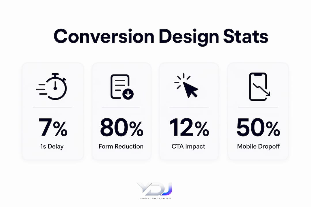
Form length has an equally dramatic effect. Reducing form fields from 7 to 3 can increase conversions by 80%. Reducing from 4 to 3 fields increases conversions by 50%. Most businesses ask for far more information than they need at the point of first contact. Every extra field is a reason to leave.
| Design Element | Impact on Conversions |
|---|---|
| Page speed (1s delay) | 7% conversion rate drop |
| Page speed (5s vs. 1s load) | 3x lower conversion rate |
| Form fields (7 reduced to 3) | Up to 80% conversion increase |
| Optimal CTA placement | 12%–34% click-through rate lift |
| Mobile CTA optimization | 23% jump in mobile conversions |
CTA placement is the third major lever. Optimizing CTA button size and placement can increase click-through rates by 12% to 34%. Mobile conversion rates jump 23% when CTAs are placed at the right point in the scroll flow. These numbers explain why conversion design is not a cosmetic exercise. It is a revenue decision.
White space also plays a direct role. Increasing white space reduces cognitive load and isolates CTAs, which improves conversion rates. Overcrowding a page with trust badges, links, and graphics dilutes focus and lowers conversions. The counterintuitive truth is that adding more elements usually hurts performance.
What practical strategies can you apply to implement conversion-focused design?
Applying conversion rate optimization design to a real site follows a clear sequence. Skipping steps creates pages that look right but do not perform.
- Set one primary conversion goal per page. Write it down before opening any design tool. Every decision you make should serve that goal. If a page has two goals, it effectively has none.
- Audit your current page for distractions. Count every link, button, and navigation item. Each one competes with your primary CTA. Remove or hide anything that does not serve the conversion goal directly.
- Fix your value proposition first. Fixing structural issues like unclear value propositions is required before testing anything else. If visitors do not understand what you offer in the first five seconds, no CTA color will save you.
- Design mobile-first. Mobile constraints force you to prioritize. Every decorative element influences page speed, which directly affects conversion rates. Designing for a small screen first naturally strips the elements that slow pages down.
- Shorten your forms. Ask only for what you need to take the next step. Name and email beat a six-field contact form for most first-touch conversions.
- Place your CTA above the fold and repeat it. Visitors who scroll past the hero section need a second opportunity to act. Repeat the CTA at logical decision points in the page flow.
- Run A/B tests only after the foundation is solid. CRO should be treated as a system built into site architecture, not a series of post-launch tweaks. Testing a headline color on a page with a broken value proposition wastes time and data.
Pro Tip: Use a free tool like Google PageSpeed Insights to check your load time before touching any visual element. Speed fixes often deliver the fastest conversion gains with the least design effort.
For entrepreneurs who want a practical checklist, the conversion tips for entrepreneurs guide at Ydjmedia covers these steps in detail for small business contexts.
How can conversion-optimized design improve long-term customer engagement?
Most designers stop thinking about conversion design the moment a visitor clicks the CTA. That is a missed opportunity. Good conversion design addresses the entire user flow, including post-conversion experiences. The thank-you page, the onboarding email, and the follow-up sequence are all design decisions that affect whether a customer returns.
Trust signals do double duty. They tip fence-sitters into customers on the first visit, and they reinforce the decision for customers who are already in. Testimonials, case studies, and guarantees placed throughout the site build a consistent narrative. The role of testimonials in conversions is well documented: social proof near a decision point reduces anxiety and increases follow-through.
Long-term engagement also depends on design consistency. When every page in your site uses the same visual language, button styles, and tone, visitors build familiarity. Familiarity reduces friction on repeat visits. A returning customer who recognizes your layout does not have to re-learn how to navigate. They act faster.
Three design habits that support long-term loyalty:
- Consistent CTA language. Use the same action words across pages so visitors build a mental model of how your site works.
- Post-conversion page design. Treat the thank-you page as a second conversion opportunity. Offer a related resource, a referral incentive, or a next step.
- Social proof rotation. Update testimonials and case studies regularly. Fresh proof signals an active, trustworthy business.
Key Takeaways
Conversion-optimized design produces measurable results because it treats every visual decision as a direct input to user behavior, not a matter of taste.
| Point | Details |
|---|---|
| One goal per page | Define a single conversion action before designing any element on the page. |
| Speed is a design decision | A 1-second delay drops conversions by 7%; treat load time as a core design constraint. |
| Subtraction beats addition | Removing distractions, extra links, and form fields consistently raises conversion rates. |
| Foundation before testing | Fix value proposition clarity and page structure before running any A/B tests. |
| Post-conversion design matters | Thank-you pages and follow-up flows are conversion opportunities, not afterthoughts. |
Why most sites get this backwards
I have reviewed hundreds of small business websites, and the pattern is almost always the same. The homepage tries to do everything at once. There is a hero section, a services grid, a blog preview, a testimonial strip, a newsletter signup, and a contact form, all competing for the visitor’s attention on a single scroll. The business owner added each element because it seemed useful. The result is a page that converts almost no one.
The hardest lesson in conversion design is that adding more almost always hurts. The instinct to add is natural. You want to show everything you offer. But visitors do not arrive ready to absorb everything. They arrive with one question: “Can this business solve my problem?” Your job is to answer that question fast, then give them one clear path forward.
I have also seen businesses spend weeks testing CTA button colors on pages where the value proposition is completely unclear. Testing is only useful after the foundation is right. Get the structure, the message, and the speed right first. Then test. The data will actually mean something.
The other mistake I see constantly is treating mobile as an afterthought. Mobile visitors abandon slow pages at a rate that should alarm every business owner. Designing mobile-first is not a trend. It is the correct order of operations for any site that wants to convert real traffic. If your site does not load fast and look clean on a phone, the rest of your design work is irrelevant for a large portion of your audience.
— Youri
How Ydjmedia builds sites designed to convert
Ydjmedia builds modern, mobile-first websites with conversion principles embedded from the first wireframe, not bolted on after launch.
Every Ydjmedia site starts with a defined primary goal, a clear value proposition, and a page structure that guides visitors toward one action. Speed, CTA placement, and trust signals are not optional extras. They are part of the standard build. You can see your site live before paying a dollar, thanks to the free demo offer. There are no retainers, no agency runaround, and a 30-day money-back guarantee. If you want a website that actually converts, Ydjmedia is built to deliver exactly that.
FAQ
What does conversion-optimized design mean?
Conversion-optimized design is the practice of structuring and styling web pages to maximize the rate at which visitors complete a specific action, such as a purchase or signup. It prioritizes a single measurable goal, deliberate visual hierarchy, and removal of distractions.
How is conversion design different from UX design?
UX design solves for usability across many tasks, while conversion design focuses on one specific outcome per page. A UX designer might add navigation options; a conversion designer removes them from landing pages to keep visitors focused.
Does page speed really affect conversions?
A 1-second page load delay reduces conversion rates by 7%, and a 3-second delay causes over 50% of mobile visitors to leave. Sites loading in 1 second convert 3x higher than those taking 5 seconds.
When should I start A/B testing my design?
Run A/B tests only after your foundational design is solid, meaning your value proposition is clear, your page structure is logical, and your load speed is fast. Testing isolated elements on a broken foundation produces misleading data.
How many form fields should a conversion page have?
Three form fields is the target for most first-touch conversion pages. Reducing from 7 fields to 3 can increase conversions by 80%, and even cutting from 4 to 3 fields delivers a 50% lift.