
Your website has about three seconds to make a case for your brand. That’s not a metaphor. Research confirms that users form credibility opinions in under three seconds, driven almost entirely by aesthetics before a single word gets read. Poor design or a slow load pushes more than half of visitors to leave immediately. That’s why website design affects perception so directly: it operates at a subconscious level, shaping trust and brand credibility before your content ever gets a fair hearing.
Here’s what that means in practice:
- Visual hierarchy and layout guide where the eye goes first, reinforcing your brand message or undermining it.
- Color and typography trigger emotional responses that users don’t consciously recognize but absolutely feel.
- Page load speed and mobile responsiveness signal reliability before a visitor reads your headline.
- Imagery and multimedia create emotional context that either builds connection or creates doubt.
- Design consistency reduces cognitive effort, making your brand feel familiar and trustworthy over time.
Positive design pulls visitors in and builds the trust that leads to action. Weak design sends them straight to the back button.
What are the core design fundamentals that shape how users see your brand?
Every element on your page sends a signal. The question is whether those signals add up to “trustworthy professional” or “skip this one.”

Layout and visual hierarchy are where perception starts. When a page is organized with a clear focal point, supporting content, and logical flow, users absorb your message without effort. When it’s cluttered or random, they feel confused and leave. Jakob Nielsen’s homepage usability research makes this concrete: visitors immediately ask “Where am I?” and “What does this site do?” If your layout can’t answer those questions at a glance, you’ve already lost them.
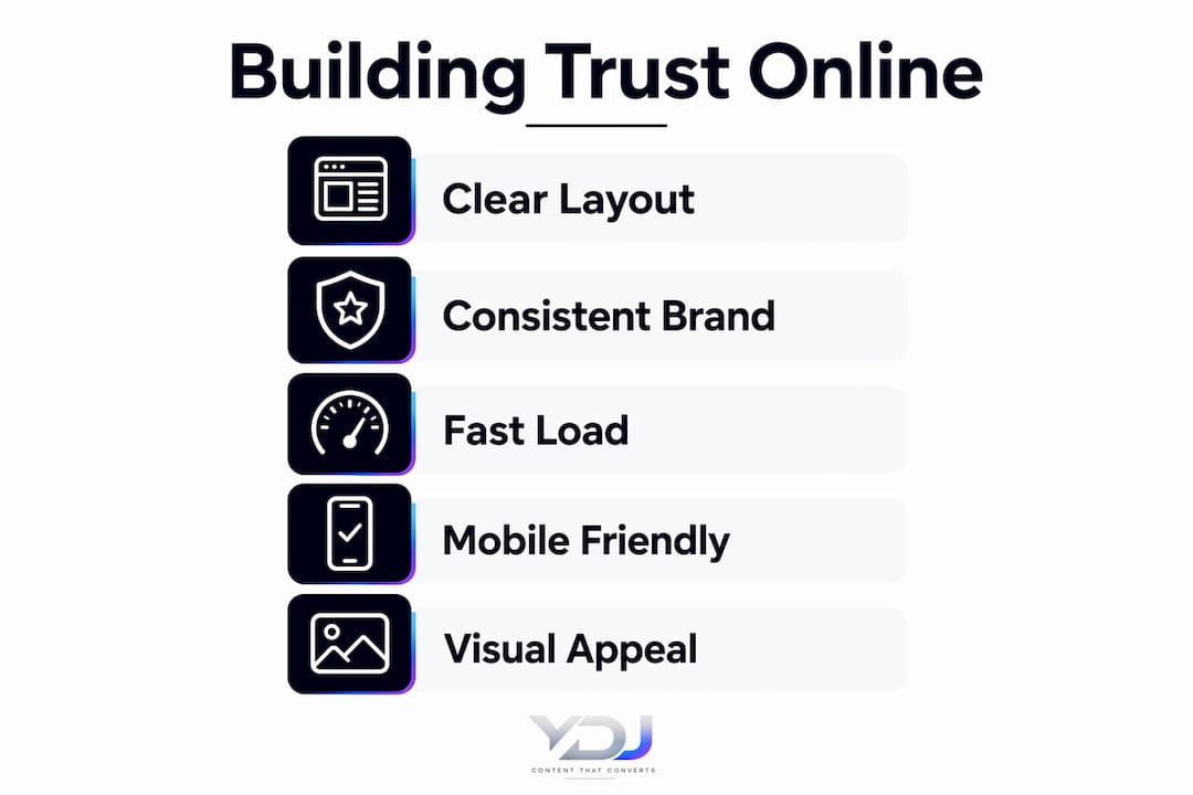
Typography does more than display words. Font choice, size, weight, and spacing communicate personality. A clean sans-serif like Inter or DM Sans reads as modern and approachable. An inconsistent font mix reads as amateur. The brand recognition impact of consistent typography is real: visual continuity signals professionalism and makes your brand feel cohesive across every page.
Key fundamentals that directly influence perception:
- Color palette: A consistent scheme builds recognition and sets the emotional tone of your brand.
- Typography: Font pairing and sizing affect readability and convey whether you’re polished or patched together.
- Page load speed: Slow pages signal unreliability. Visitors don’t wait; they leave.
- Mobile responsiveness: A site that breaks on a phone tells users you don’t care about their experience.
- Design consistency: Matching colors, fonts, and spacing across pages reduces cognitive load and builds familiarity.
- White space: Breathing room around content makes pages feel organized and easier to process.
- Clear calls to action (CTAs): Buttons and links that stand out guide users toward the next step without confusion.
Pro Tip: Run your site on a mobile device right now. If anything looks broken, overlapping, or hard to tap, that’s the first fix. Mobile visitors make up the majority of web traffic, and a broken mobile experience destroys trust faster than any other design flaw.
How do design choices affect your brain before you even realize it?
The psychological impact of web design runs deeper than most people expect. Your brain processes visual information in two stages: a fast, automatic reaction to aesthetics, followed by a slower, more deliberate evaluation of content. The first stage happens before conscious thought kicks in. That automatic reaction sets a trust baseline that colors everything the visitor reads afterward.

The amelioration effect captures this precisely. In 90% of cases studied, higher aesthetic treatment increased perceived credibility ratings for the same content. Put plainly: a well-designed page makes your information seem more credible, even when the words are identical to a poorly designed version. That effect operates at the visceral level and fades as users spend more time with your content, but it determines whether they stay long enough to reach that cognitive stage.
Color psychology plays a direct role here. Blue tones communicate trust and stability, which is why financial institutions lean on them heavily. Green signals growth or health. Red creates urgency. These aren’t arbitrary associations; they’re conditioned responses that users bring to every site they visit. Choosing colors that align with your brand values reinforces the emotional message you want to send.
Gestalt principles explain why some layouts feel coherent and others feel chaotic. Proximity groups related elements together. Similarity creates visual patterns the brain can follow. Continuity guides the eye along a path. When these principles are applied well, users navigate your site intuitively. When they’re ignored, visitors feel friction they can’t name but definitely feel.
Two specific psychological tactics worth knowing:
- The Von Restorff effect: An element that stands out from its surroundings gets remembered. This is why your primary CTA button should contrast sharply with the background.
- Fitts’ Law: Larger buttons placed closer to the user’s natural focus area are easier to click and feel less effortful to interact with. Bigger, well-positioned buttons guide behavior without feeling pushy.
Layering these principles creates a site that feels effortless to use. That effortlessness reads as professionalism, and professionalism builds trust.
Which UX signals tell visitors whether your site is worth their time?
User experience (UX) design is where perception becomes behavior. A visitor who can’t find what they need within seconds doesn’t think “this site is confusing.” They think “this brand is disorganized.” The judgment lands on you, not the navigation menu.
Nielsen Norman Group’s first impression research confirms that professional visual design creates the positive first impression that makes e-commerce transactions possible at all. Without that initial trust signal, the likelihood of a purchase drops sharply. Design isn’t decoration; it’s the foundation that makes everything else work.
Clear navigation is the most direct trust signal on any site. When users can find what they’re looking for without guessing, they feel confident in your brand. When they can’t, they feel doubt. That doubt extends to your products, your services, and your credibility as a business. Reducing cognitive load through clear structure is one of the highest-return design investments you can make.
Key UX signals that users read as trustworthiness indicators:
- Intuitive navigation: Menus that make sense, with labels that match what users expect to find.
- Consistent interactive elements: Buttons, links, and forms that behave predictably build confidence.
- Fast load times: Slow load speed causes high abandonment and signals unreliability before a visitor reads a word.
- Responsive design: A site that adapts cleanly to any screen size tells users you’ve thought about their experience.
- Imagery that fits: Authentic, high-quality photos create emotional connection. Stock photos that feel generic do the opposite. Service photos in particular build immediate credibility for local and service-based businesses.
- Accessible design: Sufficient color contrast, readable font sizes, and keyboard-friendly navigation signal that you care about all visitors, not just the easy ones.
For professional service businesses, reputation management platforms like Repvive reinforce this point: UX design and trustworthiness are inseparable in sectors where credibility is the product. The same logic applies to any small business website.
Pro Tip: Use Google PageSpeed Insights to test your load time right now. A score below 70 on mobile is costing you visitors and trust. Most speed issues come from uncompressed images and unused scripts, both of which are fixable without a full redesign.
How do you keep your website design working for your brand over time?
A well-designed site at launch can become a liability within two years if it’s not maintained. Design trends shift, user expectations rise, and technical performance degrades as plugins and platforms update around a static codebase. Keeping your site current isn’t about chasing trends; it’s about making sure your first impression stays accurate.
Regular performance audits catch problems before visitors do. Test load speed, mobile responsiveness, and broken links on a quarterly basis. These aren’t glamorous tasks, but a page that loads in five seconds on mobile in 2026 communicates the same thing as a site that looked outdated in 2018: this business isn’t paying attention.
Analytics tell you where design is failing. High bounce rates on specific pages, low time-on-page, and drop-offs before a CTA all point to friction in the design. Google Analytics and Microsoft Clarity both surface these patterns clearly. When you see a page where visitors consistently leave without clicking anything, that’s a design problem, not a content problem.
Practical maintenance habits that protect your brand perception:
- Quarterly speed tests: Use Google PageSpeed Insights or GTmetrix to catch performance drops early.
- Visual refresh cycle: Update hero images, color accents, and typography every 18–24 months to stay current without losing brand consistency.
- CTA audits: Review whether your calls to action still match your current offer and brand voice.
- Accessibility checks: Run your site through WAVE or axe DevTools to catch contrast and navigation issues.
- Content-design alignment: As your messaging evolves, make sure the visual hierarchy still emphasizes the right things.
Avoiding homepage mistakes is part of this ongoing process. Cluttered layouts, outdated photos, and unclear CTAs are the most common culprits when a previously effective site starts losing conversions. A site that looks maintained signals a business that’s active and attentive.
What does the research actually say about design and subconscious trust?
The science behind design’s impact on perception is more concrete than most people realize. Users don’t consciously decide to trust or distrust a website. The judgment happens automatically, driven by visual processing that precedes any reading or analysis.
Research published in Information Processing and Management found that credibility judgments formed in under 3 seconds, with most responses happening before any conscious reading or analysis. At that speed, no complex cognitive analysis is possible. The judgment is purely visceral, driven by aesthetics, layout, and visual coherence.
The temporal sequence of impression formation matters here. Automatic processing sets a trust baseline first. Then attentive processing either confirms or revises that baseline. If the automatic reaction is negative, most users won’t stay long enough for the attentive stage to correct it. This is why design has to earn trust before content gets the chance to.
Trust is the primary currency of e-commerce. Research on website design and user trust confirms that without an initial trust signal from professional visual design, transactions become unlikely. Companies that design for trust hold a real advantage over those that treat design as secondary to content or pricing.
Statistic to know: In 90% of cases studied, higher aesthetic treatment increased perceived credibility for the same content. That’s the amelioration effect in action, and it operates within the first few seconds of a page view.
Pro Tip: Layer psychological principles intentionally. Use color to set emotional tone, visual hierarchy to guide attention, and Fitts’ Law to make your CTA the easiest thing to click. Each principle reinforces the others, creating a trust-building flow that feels natural to visitors rather than engineered.
The practical takeaway is straightforward. Good design doesn’t just look nice. It pre-validates your content, signals professionalism, and gives visitors a reason to stay long enough to actually read what you have to say. For brand building through your website, that sequence is everything.
Ready to build a site that earns trust from the first second?
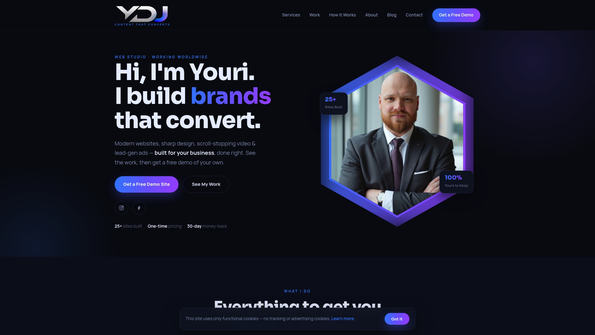
Ydjmedia builds modern, mobile-first websites designed to convert visitors into customers from the moment they land. Every site starts with a free demo so you can see exactly what your business will look like online before spending a dollar. No retainers, no agency runaround, and a 30-day money-back guarantee on every project.
If your current site isn’t building trust the way it should, see what’s possible with a site built to get results from day one.
Key Takeaways
Website design shapes user perception before a single word is read, making aesthetics the first and most powerful trust signal your brand controls.
| Point | Details |
|---|---|
| Credibility forms in seconds | Users form credibility judgments in under 3 seconds, driven by aesthetics before any content is processed. |
| The amelioration effect is real | In 90% of cases studied, higher aesthetic treatment increased perceived credibility for the same content. |
| Speed and responsiveness signal trust | Slow load times cause high abandonment and communicate unreliability before a visitor reads your headline. |
| UX clarity reduces doubt | Clear navigation and consistent interactive elements build confidence and lower cognitive load for visitors. |
| Maintenance protects perception | Regular audits of speed, CTAs, and visual elements keep your first impression accurate as expectations rise. |